
Embroidery technique
Satin, fill or running stitch: which embroidery stitch type should you use?
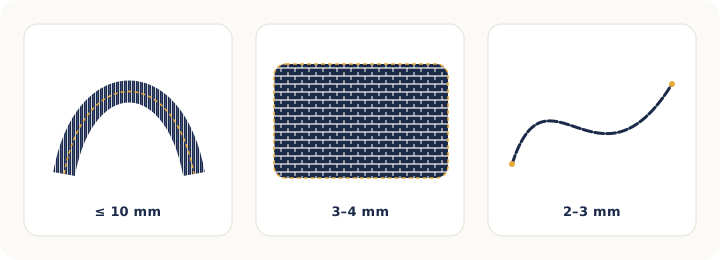
The three basic machine embroidery stitches are satin, for lettering and narrow shapes up to about 10 mm (3/8 in) wide; fill (also called tatami), for large areas; and running stitch, for outlines, fine detail and underlay.
The choice depends on the width of the area: narrow calls for satin, wide calls for fill, a line calls for running stitch.
The settings that change the result most are density, the underlay beneath and pull compensation for the fabric.
Satin stitch: for lettering and narrow bands
Satin stitch is made of parallel stitches, side by side, that span the shape from one edge to the other. It is the shiniest stitch, because the thread lies taut and smooth and reflects light. It is the stitch of lettering, bold outlines, patch borders and any narrow band.
Its limit is width: a very long thread stitch lies loose, snags and pulls out with wear. In practice satin works well from 1.5 mm to about 10 mm wide. Beyond that, software splits each stitch in two or three ("auto split") or you switch to fill.
In Meus Bordados, satin is the default for text. On closed shapes you mark angle lines with the Angles tool so turning satin follows the curve of the shape, and on open shapes there are Column C (fixed width) and Column A (variable width). See Stitch types and settings.
Fill stitch (tatami): for large areas
Fill stitch, also called tatami or complex fill, covers an area with rows of short stitches (usually 3 to 4 mm), offset from one row to the next like bricks in a wall. That offset keeps the surface even and hides the row seams.
Because it is built from short stitches, fill has no width limit and stands up well to wear and washing. In exchange it shines less than satin and uses more stitches (and more machine time) per square inch. Changing stitch length and angle creates different textures; running the fill at 45 degrees to the satin lettering helps the text stand out from the background.
Use fill for logo backgrounds, wide shapes in kids' designs, letters with strokes wider than 10 mm and appliqué-style areas.
Running stitch: outlines, detail and underlay
Running stitch is a single line of stitches, one after another. It is the most economical stitch and the only one that works on very thin lines (under 1.5 mm). Use it for outlines, details (whiskers, eyelashes, leaf veins), "pen-style" lettering, decorative topstitching and, very importantly, as underlay beneath other stitches.
The triple run (bean stitch) variant passes three times over the same path (forward, back, forward) and reads as a bolder line. It is great for outlines that must show and for 3 to 4 mm lettering where satin does not work.
Typical length: 2 to 3 mm. Shorter stitches (1.5 mm) follow tight curves better; longer ones (3.5 to 4 mm) are faster and smoother on straight lines.
Which stitch for which job? Quick table
| Situation | Stitch | Note |
|---|---|---|
| Letters 5 to 60 mm tall | Satin | With auto split above ~10 mm stroke width. |
| Letters under 5 mm | Triple run or very narrow satin | Simple bold font; test on scrap. |
| Letters with strokes over 10 mm | Fill | Or satin with auto split. |
| Logo background, wide shapes | Fill | With zigzag or light fill underlay. |
| Shape outline | Running or triple run | Stitch last, over the fill. |
| Patch or appliqué edge | Satin border or E-stitch border | E-stitch tacks appliqué down without covering the edge. |
| Very fine detail | Single running stitch | The only stitch that works under 1.5 mm. |
Density: the setting that changes the embroidery most
Density is the distance between two neighboring satin stitches or between two fill rows. "High" density means closer stitches (more coverage, more stitches, stiffer); "low" means wider spacing (lighter, fabric may show through). A common value for 40-weight thread in satin is a spacing around 0.4 mm; fill is usually a little more open.
When to adjust: increase density (smaller spacing) on terry and on dark fabrics with light thread; decrease it on light fabrics and small lettering, where too many stitches make a hard plate and cut the fabric. Never change the density of a finished design by resizing: that belongs in the project file.
Underlay: what goes underneath
Before stitching the satin or fill, the machine sews a hidden layer of running or zigzag stitches. That underlay anchors the fabric to the stabilizer, lifts the top stitching and keeps the thread from sinking. Without it, satin looks flat and fill puckers.
- Center run: one line down the middle of the column. For small lettering and narrow columns.
- Edge run: lines along the edges of the shape. Defines the outline and keeps the satin from "leaking".
- Zigzag (single or double): for wide columns and large letters; adds loft.
- Fill underlay: open rows beneath large fills, at a different angle from the top fill.
An inset of 0.3 to 0.5 mm pulls the underlay inside the outline so it does not peek out at the edges.
Pull compensation: why do letters come out thinner than on screen?
Every stitch pulls the fabric toward the center of the column. The result is that a column drawn at 3 mm sews out at 2.6 mm and the gaps between letters grow. Pull compensation extends each stitch a little beyond the outline, in the stitch direction, to make up for that shrinkage.
Starting values: 0.2 mm on stable fabrics (cotton, twill), 0.3 to 0.5 mm on knits and fleece. On very stretchy fabrics, pair it with cut-away stabilizer, which holds better. On the other hand, do not over-compensate small lettering: the counters of "e" and "a" close up.
Tip: Stitch a 10 × 30 mm satin rectangle on the job's fabric and measure it. The difference between the drawing and the real measurement is the compensation you need.
Stitch order and color changes
The last stitch defines the finish. The classic order is: underlay, background fills, satin shapes and lettering, running-stitch outlines last. Within each stage, group objects of the same color to cut thread changes: every change is a stop on a single-needle machine.
In the editor, the Objects, in stitching order list shows the sequence and the Simulate button plays the embroidery stitch by stitch with the estimated time. Turn on Jumps and trims to see where the machine will jump. See Colors and stitching order.
Frequently asked questions
What is the maximum satin stitch width?
In practice about 10 mm (3/8 in) with 40-weight thread. Beyond that the stitch lies loose and snags. Software splits longer stitches automatically or you switch to fill. Some machine formats also limit the movement per stitch (DST, for example, at 12.1 mm).
What is the difference between tatami and fill stitch?
They are the same stitch. "Tatami" is the name used by Wilcom and much of the trade; "fill" or "complex fill" is the generic name. Some programs call decorative variants "pattern fill" or "motif fill".
Why did the embroidery come out stiff, like a plate?
Density too high, underlay too heavy, or both, combined with a thick stabilizer. Lower the density (increase spacing), use lighter underlay on small areas and avoid stacking fill on fill.
Which stitch should I use on towels?
Satin for lettering, with slightly higher density and a water-soluble topping so the thread does not sink into the loops. For motifs, fill with zigzag underlay. Avoid single running stitch on terry: it disappears.
Related articles
- Embroidery techniquePolyester or rayon embroidery thread? And what about 40 wt vs 60 wt, bobbin thread and needles?Polyester or rayon for machine embroidery, what 40 wt and 60 wt mean, which bobbin thread to use and the right needle for each fabric, in one practical chart. · 7 min read
- Embroidery techniqueHow do you make embroidered patches and appliqué on an embroidery machine?Step by step for embroidered patches (base, satin border, heat-seal backing, trimming) and machine appliqué: file order, stabilizer, fabrics and mistakes to avoid. · 7 min read
- Embroidery technique12 common machine embroidery mistakes and how to fix themPuckering, thread breaks, bird nests, gaps in outlines, bobbin showing on top, hoop burn and more: the most common machine embroidery problems and the fix for each. · 6 min read